Quaking
From $19 | 1 Font Family by Fontasmic
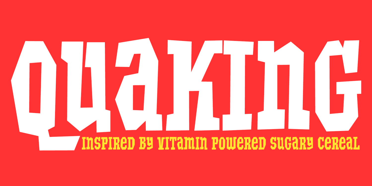
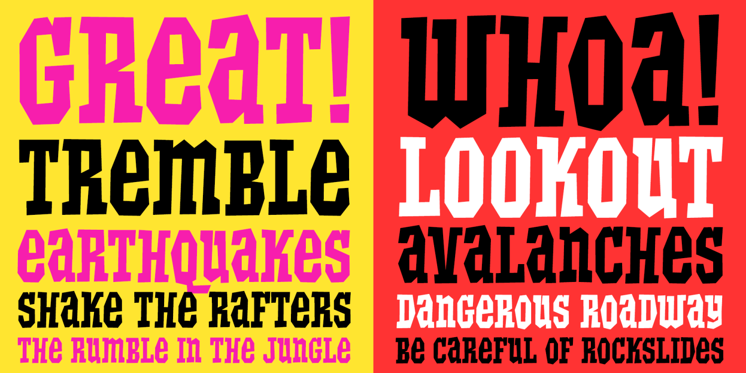
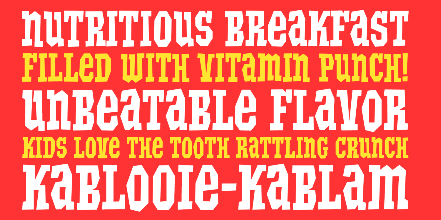
Quaking is a bold, ruckus-filled display font inspired by the unforgettable lettering on Quake cereal packaging from the late 1960s and early 1970s. It captures that high-energy, kid-hyped box-top attitude—loud shapes, chunky strokes, and playful angles that feel like they’re vibrating with breakfast-fueled chaos. If you love vintage grocery typography, Saturday-morning cartoon vibes, and classic package lettering with personality for days, Quaking brings that exact flavor back to life.
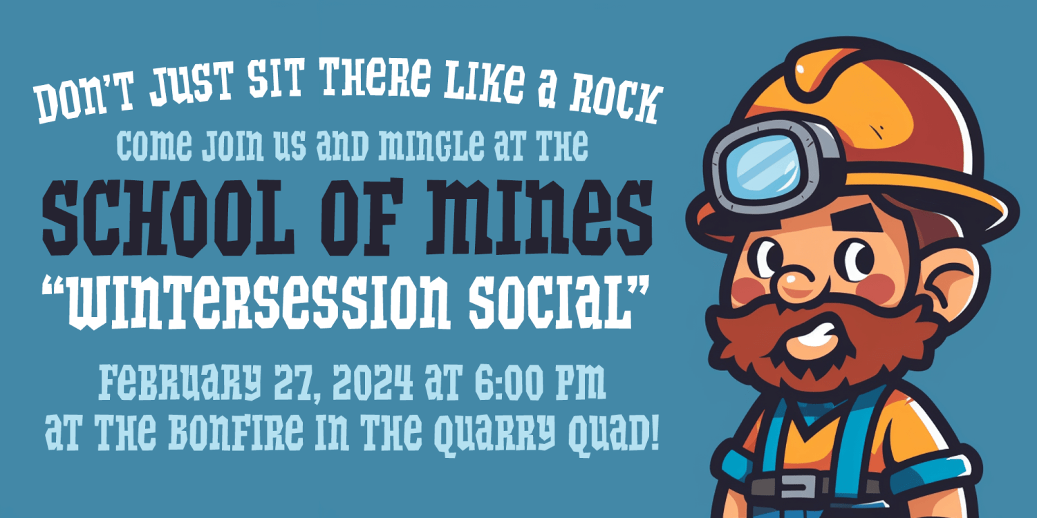
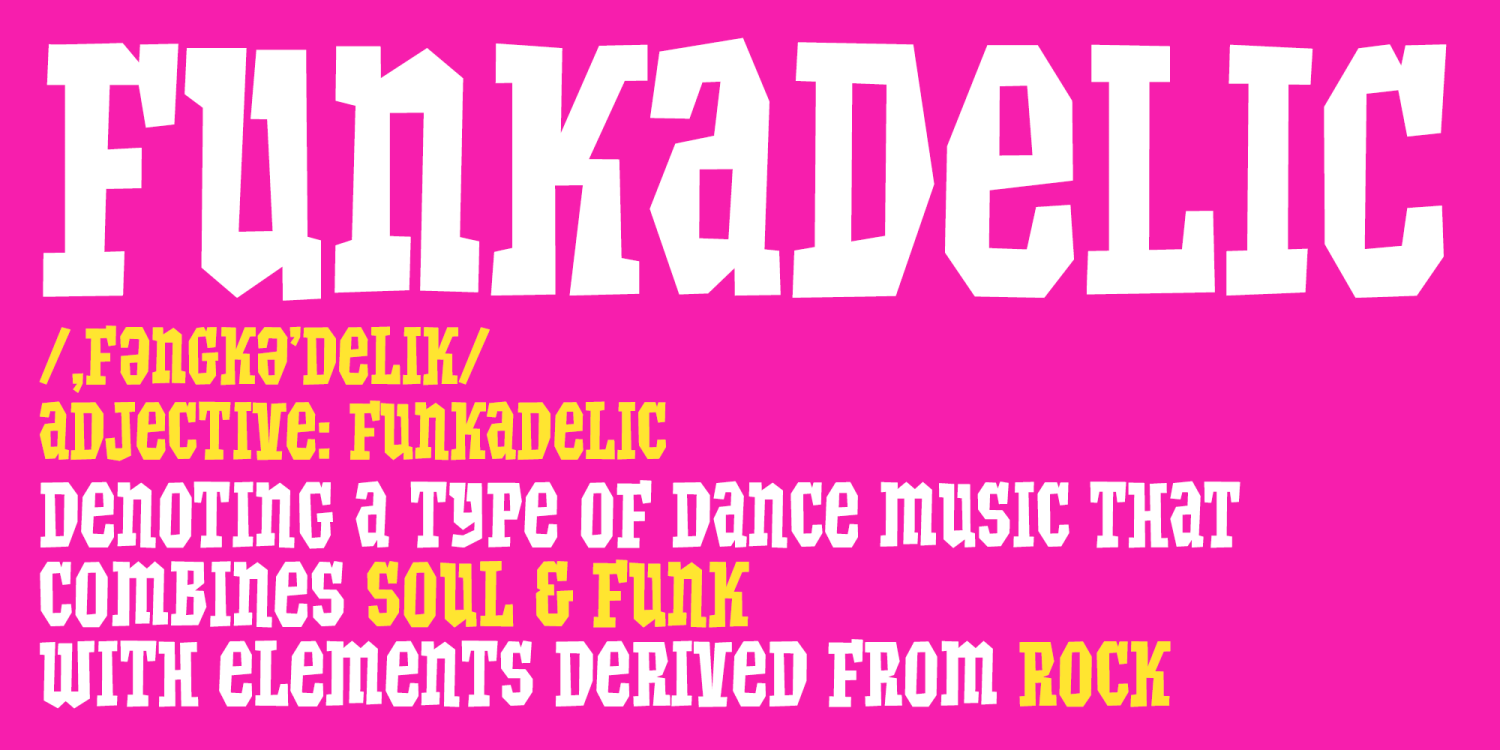
Quaking features a unicase letterset that deliberately blends the feel of uppercase and lowercase forms, mixing default and alternate versions together for a lively, less-uniform rhythm across words. The result is typography that feels hand-assembled and period-authentic, perfect for recreating nostalgic packaging energy without looking overly polished or modern.
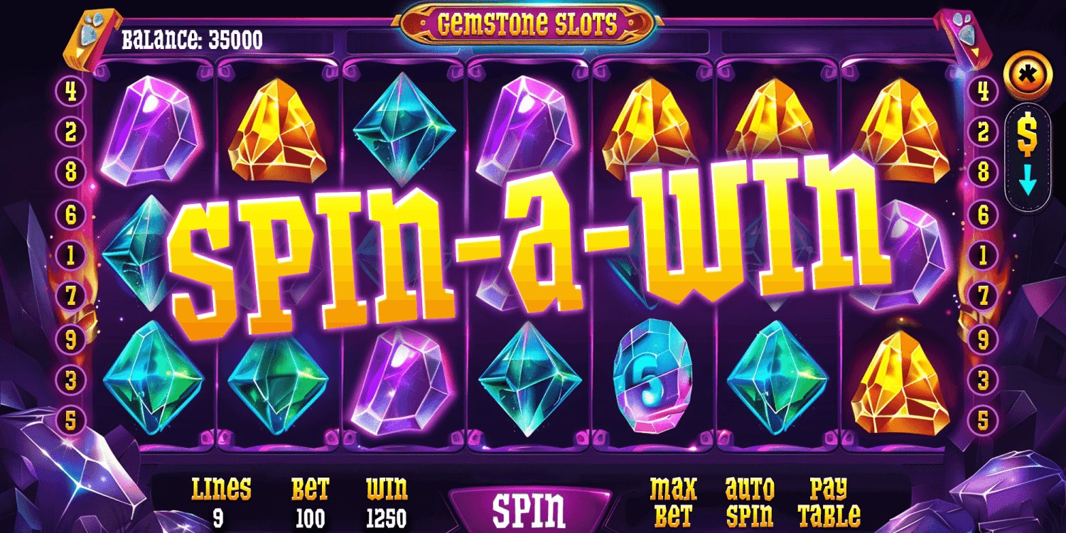
Use Quaking for retro packaging, cereal and snack branding, toy and kids products, comic-style headlines, posters, stickers, apparel graphics, bold logo marks, and any design that wants vintage supermarket charm with loud, playful character.
Get It Now from Font Bros